Cashvelope v2.0: New Identity, New Design — a complete redesign from the ground up
Same app. Completely rebuilt look. Meet Cashvelope.
v2.0 is a complete redesign. Not a polish pass, not a fresh coat of paint — every screen was rebuilt from scratch with a consistent design language and a name that actually means something: Cashvelope.
The name comes from cash envelope budgeting — the envelope system where you physically separate money into labeled envelopes for each spending category. It is one of the most effective budgeting methods ever invented. We liked the metaphor. We kept it.
Material Design 3
The visual foundation of the app is now Material Design 3 — Google's current design system, applied consistently across every screen. That means proper color tokens, adaptive surfaces, correct elevation behavior, and components that feel native on Android. No more mismatched styles between screens built at different points in time.
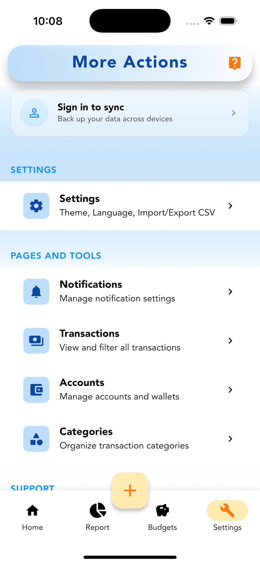
New navigation bar
The old bottom navigation used a mix of icon styles and inconsistent labels. The new bar has cleaner icons, proper active state indicators, and a layout that scales correctly across screen sizes. Navigation feels like part of the app now, not something bolted on.
Redesigned app bar
Every screen now has a consistent app bar treatment. Page titles are readable, action buttons are in predictable positions, and the back navigation behavior is consistent throughout. Small things that add up to an app that feels considered.
New category icon set
The icon set was replaced entirely. The new icons are part of the Material Symbols library — consistent stroke weight, consistent size, consistent style. Food icons look like food icons. Transport icons look like transport icons. The visual vocabulary of the app is coherent for the first time.
Consistent color scheme and buttons
Primary actions use a consistent accent color throughout. Destructive actions use red. Secondary actions use the surface color system. Button styles are standardized — filled for primary actions, outlined for secondary, text for tertiary. No more visual guessing about what button does what.
A clean foundation
v2.0 is not just a redesign — it is the foundation that the next set of features is built on. Cloud sync, multi-wallet support, advanced filtering, receipts — all of that is coming, and all of it will look right because the design system is now solid underneath it.