
How to read your Daykept report: entries, streaks, and mood over time
Your streak, entries, words, days written, writing-day charts and mood distribution: what each part of the Daykept Report tells you and how to use it.
You can feel whether journaling is going well. You cannot always see it. The Report screen turns months of entries into a few clear numbers: how often you write, how much you write, how your mood has shifted. It is not analytics for the sake of it. Think of it as a mirror for a habit you are trying to build.
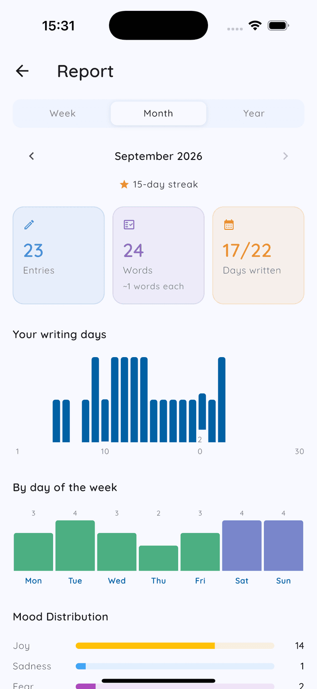
Open Report from the chart button on your Home screen, or from Settings → Report.
Week, Month, Year: pick your lens
At the top you can switch between Week, Month, and Year. Use the arrows on either side of the date to move backward and forward in time.
Week view is useful for checking in mid-week. Are you on track? Month view shows the shape of a full month at a glance. Year view is where patterns become undeniable: the months you were consistent, the stretches you fell off, and what was happening when both occurred.
Your streak
Just under the date, Report shows your current streak, meaning consecutive days with at least one entry. Daykept's streak is forgiving: grace days mean one missed day doesn't erase your progress. Treat it as optional motivation. Some people are energized by it; others prefer to ignore it. Both are fine.
The three numbers
- Entries. How many times you wrote in the selected period. One a day is a great target; one a week still adds up to 52 a year.
- Words. Total words across all entries. Small daily entries add up to thousands of words over a month. Seeing it makes the habit feel real.
- Days written. How many days you wrote out of the days in the period so far. More honest than a streak: a week with five scattered days still counts as five.
Your writing days
The first chart shows when you wrote across the period. Taller bars mean more entries that day or month; gaps mean you didn't write. A gap is worth noticing. You don't have to judge it.
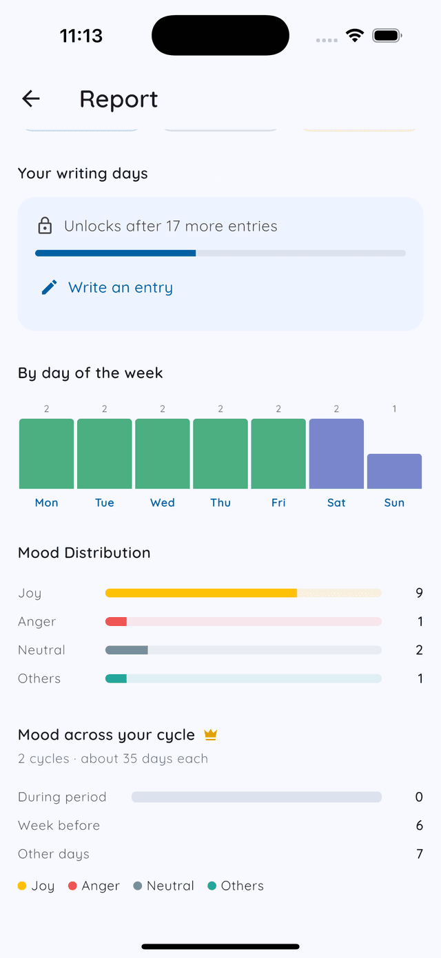
New to Daykept? The charts wait until there is enough to show: the monthly chart appears after 10 entries, the yearly one after 30, and the day-of-week chart after 10. Until then, Report tells you how many more entries unlock it.
By day of the week
This chart counts entries by weekday. It answers a surprisingly useful question: which days do you actually show up? If Thursdays are always empty, that is not a character flaw. It's a scheduling fact. Move your journaling time, or accept Thursdays off.
Mood Distribution
The last section shows how your moods break down across the period, grouped into Joy, Sadness, Fear, Anger, Neutral, and Others, with one bar per group with a count on the right.
It only fills in if you pick a mood when you write, and every Daykept entry starts with one. Over time the distribution shows trends that are hard to feel day to day: a run of neutral weeks, a spike in joy one month, a stretch where things were heavier. For more on reading it, see how to keep a mood journal.
If you track your cycle on the calendar, Report can also show mood across your cycle after two full cycles. See mood and your menstrual cycle (Premium · free during early access).
How to use the report well
Check it at the end of each month, not every day. The report is a retrospective tool, not a dashboard. Open it, look at the three numbers, glance at the charts, and read a few entries from the days or months where the bars were highest or lowest. That is the whole review. It takes five minutes and tells you more than any daily check could.
If you are new to Daykept, start with what a daily check-in actually is. Once you have a few weeks of entries, the Report screen becomes worth opening. For structuring what you write, see how templates help you get started.
Try Daykept, a gentle journal built around how you feel
Free to download. Writing is free forever. No account needed to start.
Learn more →