
How to read your Cashvelope report and what your typical month looks like
Total spending, a fair comparison with last month, your typical month of fixed and flexible costs, where the money went, and the trends behind it.
The report turns a month of single entries into a picture: how much went out, how that compares with last month, what a normal month looks like for you, and where the money went. Reading it takes two minutes.
Opening the report
On Home, tap Report. It opens on the current month. Use the arrows to move between months, or switch to Yearly for the whole year.
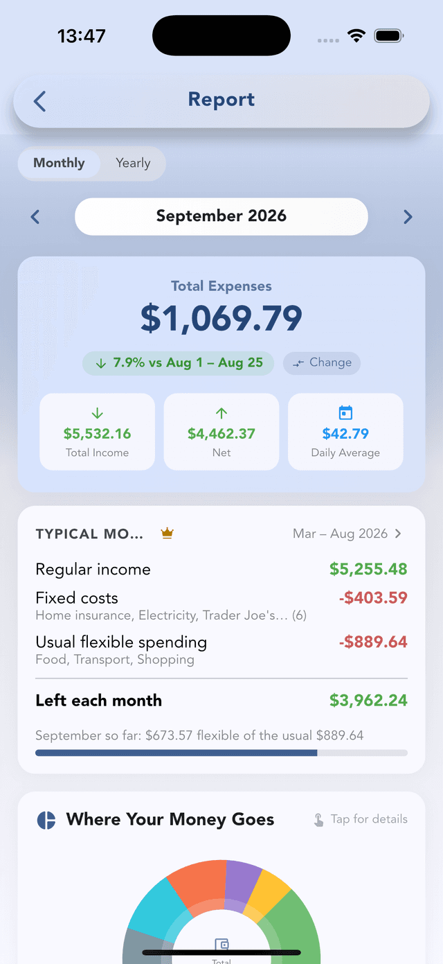
The headline numbers
- Total expenses for the month.
- The comparison with the same days last month ("↓ 7.9% vs Aug 1 – Aug 25"), so a half-finished month isn't compared with a full one. Tap Change to compare with a different period.
- Total income, Net (income minus expenses) and Daily average.
Typical month
This is the part that changes how you set budgets. Cashvelope looks at your last six months and shows:
- Regular income: what usually comes in.
- Fixed costs: the bills that repeat: rent or mortgage, insurance, utilities, subscriptions.
- Usual flexible spending: food, transport, shopping: the part you actually decide on.
- Left each month: what's usually left after both.
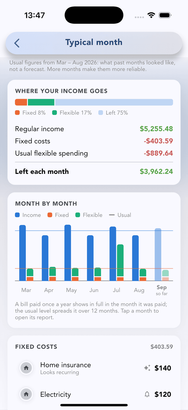
A line underneath tracks the current month against it: "September so far: $673 flexible of the usual $889". Below, each of the six months is listed. Tap one to open its report. A bill paid once a year shows in full in the month you paid it, but the usual level spreads it over twelve months, so one big insurance payment doesn't distort your picture.
Typical month is built from what already happened. It's not a forecast. It's Pro · free during early access, and it appears after your first full month of data.
Where your money goes
A chart of spending by category. Tap it for the full breakdown. When a category runs well above your usual month, the report says so, for example "Food was 24% above your usual month".
Trends
- 6-month trend: one bar per month, so you see direction, not just this month.
- Spending by day: which weekday you spend most on. Often it's the weekend, sometimes it's payday.
- Weekly breakdown: which week of the month was heaviest.
A five-minute month-end routine
On the last day of the month, open the report and answer three questions:
- Was Net positive? If not, was it a one-off or flexible spending creeping up?
- Is flexible spending above your typical month? That's the part a budget can change.
- Which week or weekday stood out? Open the calendar to see which days drove it.
Then adjust next month's budgets to match how you actually live. A limit you always blow teaches you nothing.