
The Cashvelope home screen: your month at a glance
Income and spending this month, how it compares with last month, your usual flexible spending, top categories and recent transactions, all on one screen.
Open Cashvelope and the Home screen answers one question without any digging: how is this month going? Here's what each part tells you, from top to bottom.
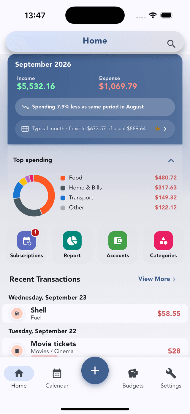
This month: income and expense
The card at the top shows the month's income and expense so far. Under it, one line compares you with last month over the same number of days, for example "Spending 7.9% less vs same period in August". Comparing the same days matters: on the 10th, a full previous month would always look bigger.
Typical month
The next line compares this month's flexible spending with your usual level: "flexible $673 of usual $889". Tap it to open Typical month: your usual income, fixed costs, flexible spending and what's usually left over, from the last six months. It's a summary of what already happened, not a forecast. Typical month is Pro · free during early access. More in the monthly report guide.
Top spending
A donut chart of where the month's money went, with the biggest categories listed beside it: Food, Home & Bills, Transport and the rest grouped as Other. Collapse it with the arrow if you'd rather see more transactions.
Shortcuts
Four buttons take you to the pages you'll use most:
- Subscriptions: recurring bills and subscriptions with monthly and yearly totals, reminders, and charges that look recurring for you to review. See the subscription audit.
- Report: the month or year in detail.
- Accounts: every account, your net worth, and your asset allocation.
- Categories: add, rename, pin or merge categories and subcategories.
Recent transactions
The latest entries, grouped by day. Tap one to edit it, or View more for the full list. The search icon at the top finds any transaction by name or note, with filters for dates, categories and accounts.
Outside the app
Add a home screen widget (iOS and Android): Quick Add to log without opening the app, or Net Worth to see the total at a glance.
What Home is for
Home is a daily check. Ten seconds, then close the app. For patterns over months, open the report; for a single day, use the calendar. And if the numbers look thin, the fix is usually logging right after you pay.